
Practice Free TDA-C01 Exam Online Questions
DRAG DROP
You have a data source that contains the following columns.
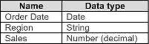
You want to filter regions based on the highest sales. Users must be able to specify the number of regions shown.
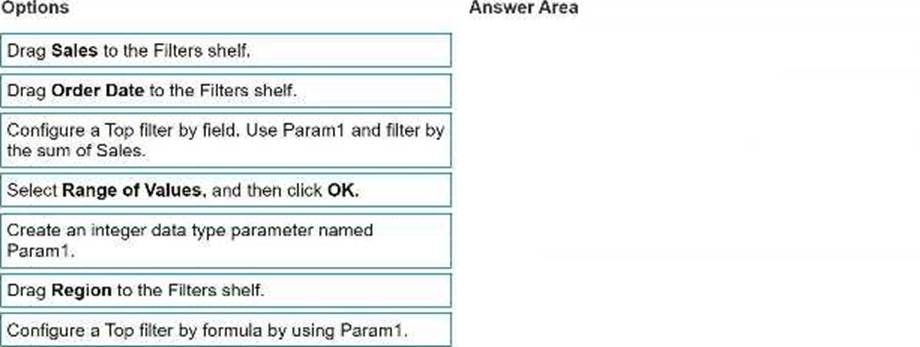
Which three actions should you perform in order? (Place the three correct options in order. Use the arrows to move Options to Answer Area.
Use Answer Area arrows to re-order the options.)
Explanation:
To filter regions based on the highest sales and allow users to specify the number of regions shown,
you should perform these actions in order:
Answer area:
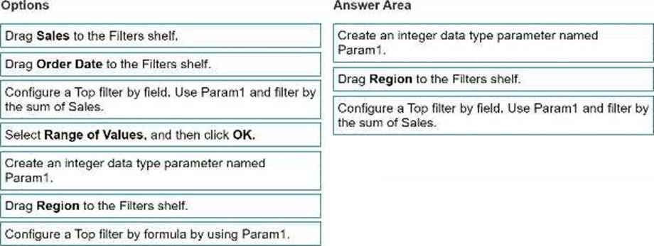
Create an integer data type parameter named Param1.
Drag Region to the Filters shelf.
Configure a Top filter by field. Use Param1 and filter by the sum of Sales.
To create a dynamic filter that lets users choose the number of regions to display, you need to use a parameter and a top filter. A parameter is a user-defined variable that can be used in calculations, filters, and reference lines. A top filter is a type of filter that shows only the top or bottom N values based on a specified field or expression.
In this question, you want to filter regions based on the highest sales. You also want users to be able to specify the number of regions shown.
To achieve this, you need to follow these steps:
First, you need to create an integer data type parameter named Param1. This parameter will allow users to enter a number that will determine how many regions to show. You can create a parameter by right-clicking on the Data pane and selecting Create Parameter. Then, you need to specify the name, data type, current value, and allowable values for the parameter. In this case, you can choose Integer as the data type, 10 as the current value, and All as the allowable values. You also need to show the parameter control by right-clicking on the parameter and selecting Show Parameter Control. This will display a slider or a text box where users can enter or adjust the parameter value. Next, you need to drag Region to the Filters shelf. This will open the Filter dialog box, where you can choose how to filter the Region field. You can filter by general, wildcard, condition, or top. In this case, you want to filter by top, so you need to select the Top tab.
Finally, you need to configure a top filter by field. Use Param1 and filter by the sum of Sales. This will filter the Region field by showing only the top N regions based on the sum of Sales, where N is the value of the parameter Param1. You can configure a top filter by field by selecting By field in the Top tab, then choosing the parameter Param1 from the drop-down list, and selecting the aggregation function Sum and the field Sales from the other drop-down lists. This will create a filter expression that looks like this: Top Param1 by SUM(Sales).
By following these steps, you will create a filter that shows only the regions with the highest sales, and allows users to change the number of regions shown by adjusting the parameter value.
Reference: Tableau Certified Data Analyst Exam Prep Guide, page 10, section “Filtering Data”
Tableau Help: Parameters
Tableau Help: Top Filters
You have the following dataset in Microsoft Excel.
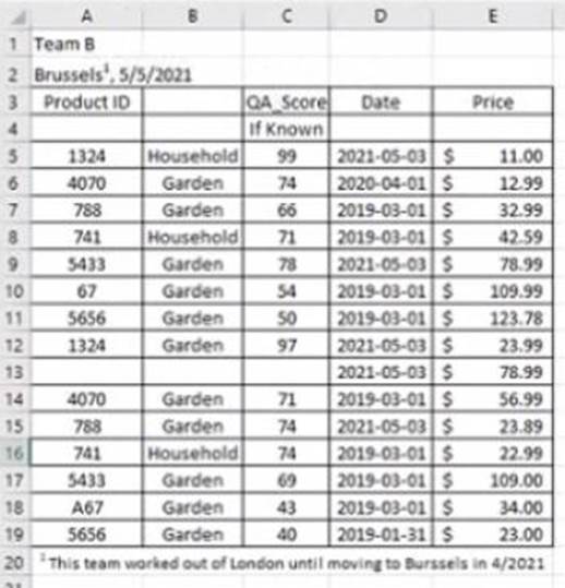
You are using interpreter to cleans the dataset.
Data interpreter provides the following results.
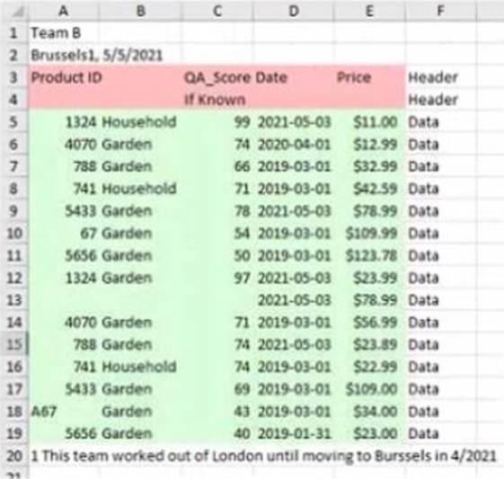
How many rows of data will be ingested into Tableau as values?
- A . 10
- B . 20
- C . 17
- D . 15
C
Explanation:
Data interpreter is a feature that helps you clean and structure your data in Excel before importing it into Tableau. It detects and removes any headers, footers, subtotals, or other elements that are not part of the actual data. It also splits any merged cells and fills in any missing values.
In this case, data interpreter provides the following results:
It removes the first three rows and the last two rows that contain headers and footers.
It splits the merged cells in column A and fills in the missing values with “Fiction” or “Non-Fiction”.
It does not remove or change any other rows or cells.
Therefore, the number of rows of data that will be ingested into Tableau as values is 17, which is the number of rows left after removing the headers and footers.
Reference:
https://help.tableau.com/current/pro/desktop/en-us/importing_cleaning_up_data.htm
https://help.tableau.com/current/pro/desktop/en-us/importing_data_interpreter.htm
You have the following visualization.
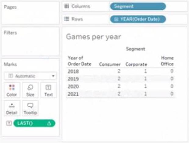
The Last() calculation is set to compute using Table (across)
Which value will appear in the crosstab for the Consumer segment of the year 2018 if you change compute to use Oder Dale?
- A . 0
- B . 2
- C . 4
- D . 3
D
Explanation:
The value that will appear in the crosstab for the Consumer segment of the year 2018 if you change compute to use Order Date is 0. The Last() calculation is a table calculation that returns the number of rows from the current row to the last row in the partition. The partition is determined by how you compute the calculation. In this case, you change compute to use Order Date, which means that the calculation will be performed for each value of Order Date.
The crosstab shows that there are two values of Order Date for the Consumer segment of the year 2018: Q1 and Q4. The Last() calculation will return 0 for Q4, because it is the last row in the partition. It will return 1 for Q1, because it is one row away from the last row in the partition.
The other options are not correct for this scenario. The Last() calculation will not return 2, 3, or 4 for any value of Order Date, because there are only two values in each partition.
Reference:
https://help.tableau.com/current/pro/desktop/en-us/calculations_tablecalculations.htm
https://help.tableau.com/current/pro/desktop/en-us/calculations_tablecalculations_functions.htm#LAST
You need to change the values of a dimension without creating a new field.
What should you do?
- A . Rename the fields
- B . Create aliases
- C . Create groups
- D . Transforms the fields
B
Explanation:
You can create aliases for the members of a dimension by right-clicking the dimension in the Data pane or in the view and selecting Aliases. This changes how the values are displayed in the view, but not the underlying data. For example, you can create an alias for “Central” as “Midwest”.
You have the following Map.
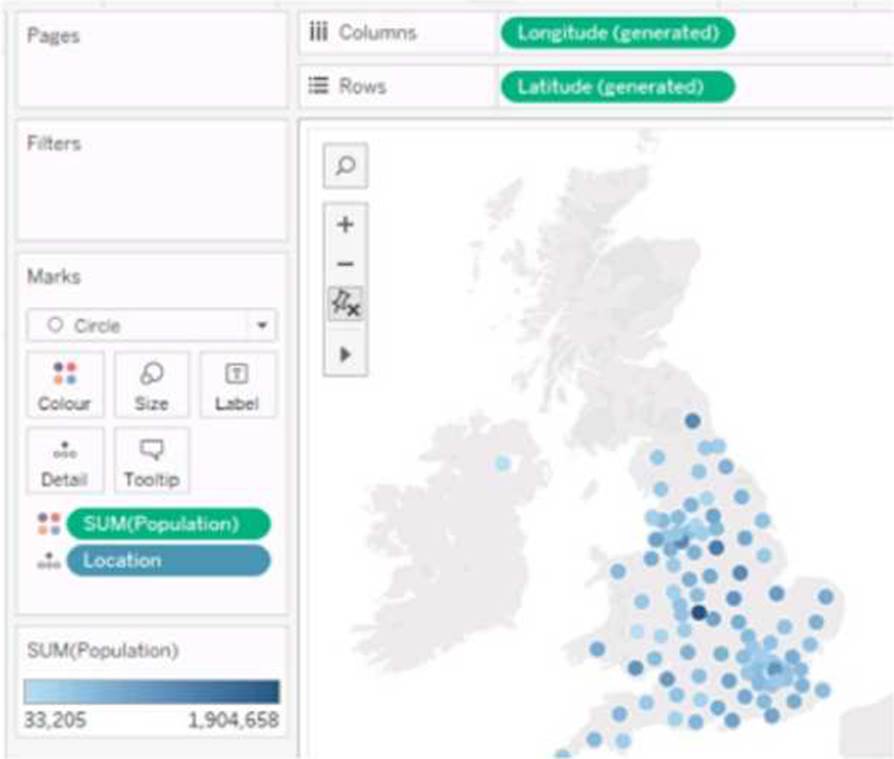
You need the map to appear as shown in the following visualization.
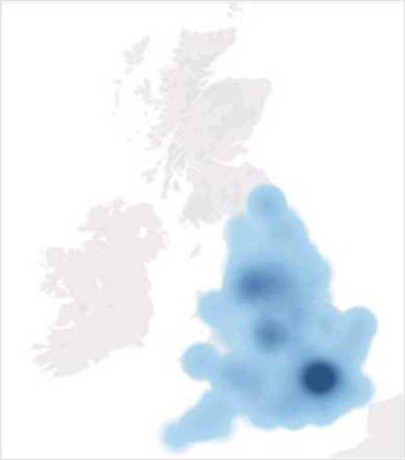
What should you do?
- A . Drag Location to Size on the Marks card.
- B . Change the opacity to 75%.
- C . Drag Population to Size on the Marks card.
- D . Change the mark type to Density.
- E . Change the mark type to Map.
D
Explanation:
To create a map visualization that shows the concentration of data points in different locations, you need to change the mark type to Density. This will create a heatmap that uses color and size to indicate the density of the data points. You can also adjust the intensity and transparency of the density marks to suit your needs.
Reference: The information is based on the following sources: Create Heatmaps that Show Trends or Density in Tableau Build a Simple Map – Tableau
HOTSPOT
You have a data source that contains the following columns.
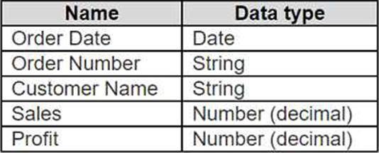
You want to sort customers based on the most expensive orders.
How should you complete the formula? (Use the dropdowns in the Answer Area to select the correct options to complete the formula.)


Open the link to Book1 found on the desktop. Open the Histogram worksheet and use the Superstone data source.
Create a histogram on the Quantity field by using bin size of 3.
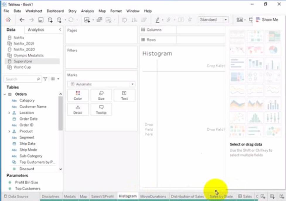
Click on the Histogram tab at the bottom of the workbook to open the Histogram worksheet. You will see a blank worksheet with no marks.
Right-click on Quantity in the Measures pane and select Create Bins from the menu. This will open a dialog box that allows you to create bins for the Quantity field. Bins are groups of values that are treated as one unit in a histogram.
Enter 3 in the Size of bins text box. This will set the bin size to 3, which means that each bin will contain values that are 3 units apart. For example, one bin will contain values from 0 to 2, another bin will contain values from 3 to 5, and so on.
Click OK to create the bins. You will see a new field named Quantity (bin) in the Measures pane with a # sign next to it.
Drag Quantity (bin) from the Measures pane to Columns on the worksheet. This will create a histogram that shows the distribution of Quantity by bins. You will see bars that represent the frequency or count of values in each bin.
Optionally, you can adjust the width, color, and labels of the bars by using the options on the Marks card. You can also add filters, tooltips, or annotations to enhance your histogram.
Reference:
https://help.tableau.com/current/pro/desktop/en-us/histograms.htm
https://help.tableau.com/current/pro/desktop/en-us/calculations_bins.htm
https://help.tableau.com/current/pro/desktop/en-us/buildmanual_histograms.htm
Open the link to Book1 found on the desktop. Open SalesVSProfit worksheet.
Add a distribution band on Profit to show the standard deviation from- 1 to 1.
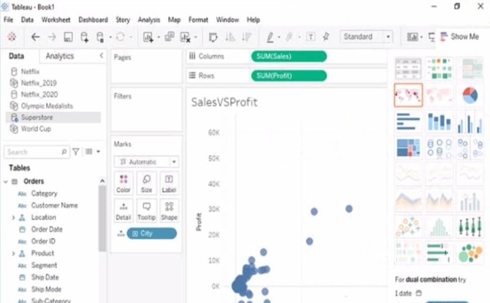
Open the link to Book1 found on the desktop. This will open the Tableau workbook that contains the SalesVSProfit worksheet.
Click on the SalesVSProfit tab at the bottom of the workbook to open the worksheet. You will see a scatter plot that shows the relationship between Sales and Profit for each Sub-Category.
Click on the Analytics tab on the left side of the workbook to open the Analytics pane. You will see a list of analytical objects that you can drag and drop onto your worksheet.
Drag Distribution Band from the Analytics pane to Profit on the Rows shelf. This will add a distribution band on Profit that shows the average and confidence interval for each Sub-Category. Click on the Edit button on the distribution band to open the Edit Distribution Band dialog box. You will see options to customize your distribution band.
Change the Band From value to -1 and the Band To value to 1. This will change the distribution band to show the standard deviation from -1 to 1, which means one standard deviation below and above the average.
Click OK to apply the changes. You will see that the distribution band now shows a narrower range of values for Profit.
Reference:
https://help.tableau.com/current/pro/desktop/en-us/analytics.htm
https://help.tableau.com/current/pro/desktop/en-us/analytics_distributionband.htm
https://help.tableau.com/current/pro/desktop/en-us/analytics_distributionband_edit.htm
You have the following dashboard.
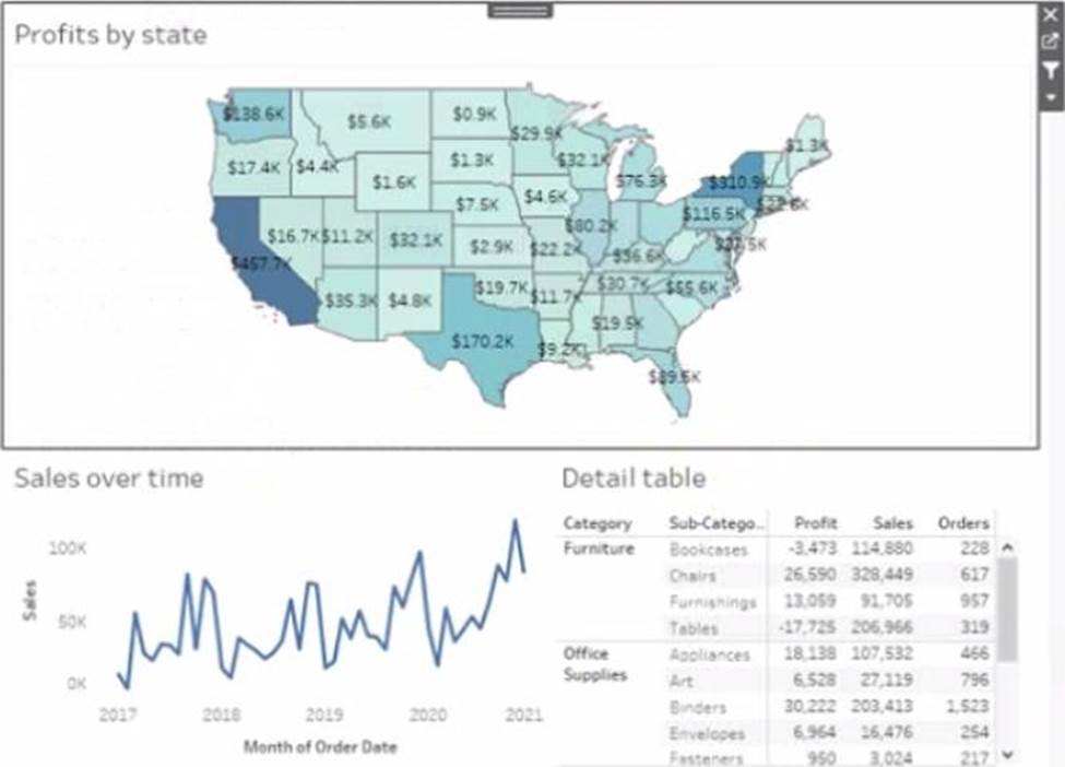
Currently the map is used as a filter that affects the data on the otter sheets of the dashboard
You need to configure the dashboard to ensure that selecting a data point on the map only tillers the Detail table
What should you do?
- A . From the context menu of Sales over time select Ignore Actions
- B . From the context menu of Sales over lime select Remove Dashboard Item
- C . From the context menu of Profits by Stale deselect Use as Filter
- D . From the context menu of Sales over time select Deselect
A
Explanation:
To configure the dashboard to ensure that selecting a data point on the map only filters the Detail table, you should select Ignore Actions from the context menu of Sales over time. Ignore Actions is a feature that allows you to exclude a sheet from being affected by any actions on the dashboard, such as filters or highlights. You can select Ignore Actions by right-clicking on a sheet on the dashboard and selecting Ignore Actions from the menu.
In this case, you want to exclude Sales over time from being filtered by the map, so you should select Ignore Actions from its context menu. This will make Sales over time ignore any selections on the map and show all values. The Detail table will still be filtered by the map as usual.
The other options are not correct for this scenario. Removing Dashboard Item will delete Sales over time from the dashboard, which is not what you want. Deselecting Use as Filter will disable the map as a filter for any sheet on the dashboard, which is not what you want. Selecting Deselect will clear any selections on the map, but it will not prevent Sales over time from being filtered by future
selections.
Reference:
https://help.tableau.com/current/pro/desktop/en-us/actions.htm
https://help.tableau.com/current/pro/desktop/en-us/actions_ignore.htm
You create a parameter named Choose Region fiat contains values from a field named Region.
You want users to be able to use the Choose Region parameter to interact with a chart by logging
between different regions
What should you do next?
- A . Add Region to me Fitters card
- B . Add the [Region] = [choose Region) formula to the Filters card
- C . Add the Choose Region parameter to the Pages card
- D . Set the Choose Region parameter to Single Value (list)
A
Explanation:
To use the Choose Region parameter to interact with a chart by toggling between different regions, you should add the [Region] = [Choose Region] formula to the Filters card. This formula will create a boolean filter that returns TRUE if the value in the Region field matches the value in the Choose Region parameter, and FALSE otherwise. You can add this formula to the Filters card by right-clicking on it and selecting Add Filter from the menu. Then you can select Condition from the dialog box and enter the formula in the text box. This will filter the chart to show only the data for the selected region.
The other options are not correct for this scenario. Adding Region to the Filters card will create a categorical filter that shows a list of values from the Region field, but it will not use the Choose Region parameter. Adding the Choose Region parameter to the Pages card will create a page control that allows you to cycle through different values of the parameter, but it will not filter the chart. Setting the Choose Region parameter to Single Value (list) will change how the parameter control appears on the worksheet, but it will not affect how it interacts with the chart.
Reference:
https://help.tableau.com/current/pro/desktop/en-us/parameters.htm https://help.tableau.com/current/pro/desktop/en-us/filtering.htm https://help.tableau.com/current/pro/desktop/en-us/filtering_condition.htm