
Practice Free PL-300 Exam Online Questions
Note: This question is part of a series of questions that use the same scenario. For your convenience, the scenario is repeated in each question. Each question presents a different goal and answer choices, but the text of the scenario is the same in each question in this series.
You have a Microsoft SQL Server database that contains the following tables.

The following columns contain date information:
– Date[Month] in the mmyyyy format
– Date[Date_ID] in the ddmmyyyy format
– Date[Date_name] in the mm/dd/yyyy format
– Monthly_returns[Month_ID] in the mmyyyy format
The Order table contains more than one million rows.
The Store table has a relationship to the Monthly_returns table on the Store_ID column. This is the
only relationship between the tables.
You plan to use Power BI Desktop to create an analytics solution for the data.
You need to create a relationship between the Monthly_returns table and Date[Date_ID].
What should you do before you create the relationship?
- A . In the Date table, create a new calculated column named MonthJD that uses the yyyydd format.
- B . In the Monthly_returns table, create a new calculated column named DateJD that uses the ddmmyyyy format.
- C . To the Order table, add a calculated column that uses the RELATED(Monthly_returns[Month_ID]) DAX formula.
- D . To the Date table, add a calculated column that uses the RE LATE D(Monthly_ret urns [MonthJD]) DAX formula.
B
Explanation:
Reference: https://docs.microsoft.com/en-us/power-bi/desktop-create-and-manage-relationships
You have a Power BI model that contains a table named Sales.
The Sales table contains the following columns:
• Order Line ID
• Product ID
• Unit Price
• Order ID
• Quantity
Orders are uniquely identified by using the order ID and can have multiple order lines Each order line within an order contains a different product ID.
You need to write a DAX measure that counts the number of orders.
Which formula should you use?
- A . CountRows(‘Sales’)
- B . Count (‘Sales'(Order ID])
- C . CountA (Sale** (Order ID])
- D . DistinctCount (sales'[Order ID])
You have a Power B1 semantic model that contains tour queries named Query 1, Query2, Query3, and Query4, Query1 loads customer data Into the model and is referenced by the other three queries. You discover that data refresh for the model is slow.
You need to improve the data refresh time. The solution must minimi2e costs.
What should you do?
- A . Run the Table. buffer function in Query 1.
- B . From the Power B1 Admin portal. Increase the Capacity settings.
- C . Reconfigure Query1 as a dataflow entity.
- D . Duplicate Query1 to all the other queries.
For the sales department at your company, you publish a Power Bl report that imports data from a Microsoft Excel We located in a Microsoft SharePoint folder The data model contains several measures You need to create a Power Bl report from the existing data. The solution must minimize development effort.
Which type of data source should you use?
- A . a SharePoint folder
- B . Power Bl dataflows
- C . an Excel workbook
- D . Power Bl dataset
A
Explanation:
case states there is already a report published and the datamodel contains measures. therefore and to be able to use the measures in the datamodel you should connect to the existing dataset (which was created when you plublished the report) instead of starting from scratch with the files in the SharePoint folder.
You create the following step by using Power Query Editor.
= Table.ReplaceValue(SalesLT_Address,"1318","1319",Replacer.ReplaceText,{"AddressLine1"})
A row has a value of 21318 Lasalle Street in the AddressLine1 column.
What will the value be when the step is applied?
- A . 1318
- B . 1319
- C . 21318 Lasalle Street
- D . 21319 Lasalle Street
D
Explanation:
Example:
Replace the text "ur" with the text "or" in the table.
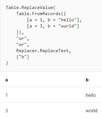
Reference: https://docs.microsoft.com/en-us/powerquery-m/table-replacevalue
You plan to use Power Bl Desktop to create a bog tracking dashboard that will pull data from Analytics in Azure DevOps.
From Power Bl Desktop, you need to configure a data connector to authenticate to Azure DevOps.
The solution must meet the following requirements:
• Use Analytics views.
• Filter data from the cloud.
Which connector should you use?
- A . OData queries
- B . Azure DevOps (Boards only)
- C . Azure DevOps Server (Boards only)
- D . OData feed
You need to ensure that the data is updated to meet the report requirements. The solution must minimize configuration effort.
What should you do?
- A . From each report in powerbi.com. select Refresh visuals
- B . From Power Bl Desktop, download the PBIX file and refresh the data.
- C . Configure a scheduled refresh without using an on-premises data gateway.
- D . Configure a scheduled refresh by using an on-premises data gateway
You have a Power Bl app that contains a report named Report1.
You add a new page to Report1.
You need to ensure that users can view the new page. The solution must minimize administrative effort.
What should you do?
- A . Update the audience in the app.
- B . Update the app.
- C . Update the contact information in the app-
- D . Unpublish and create a new app.
You have a Microsoft Power BI data model that contains three tables named Orders, Date, and City.
There is a one-to-many relationship between Date and Orders and between City and Orders.
The model contains two row-level security (RLS) roles named Role1 and Role2. Role1 contains the following filter.
City[State Province] = "Kentucky"
Role2 contains the following filter.
Date[Calendar Year] = 2020
If a user is a member of both Role1 and Role2, what data will they see in a report that uses the model?
- A . The user will see data for which the State Province value is Kentucky and the Calendar Year is 2020.
- B . The user will see data for which the State Province value is Kentucky or the Calendar Year is 2020.
- C . The user will see only data for which the State Province value is Kentucky.
- D . The user will receive an error and will not be able to see the data in the report.
B
Explanation:
When a report user is assigned to multiple roles, RLS filters become additive. It means report users can see table rows that represent the union of those filters.
Reference: https://docs.microsoft.com/en-us/power-bi/guidance/rls-guidance