Practice Free PL-300 Exam Online Questions
HOTSPOT
You have a folder of monthly transaction extracts.
You plan to create a report to analyze the transaction data.
You receive the following email message: "Hi. I’ve put 24 files of monthly transaction data onto the shared drive. File Transactions201901.csv through Transactions201912.csv have the latest set of columns, but files Transactions201801.csv to Transactions201812.csv have an older layout without the extra fields needed for analysis. Each file contains 10 to 50 transactions."
You get data from the folder and select Combine & Load. The Combine Files dialog box is shown in the exhibit. (Click the Exhibit tab.)
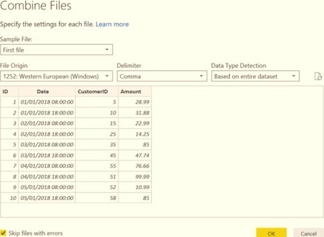
For each of the following statements, select Yes if the statement is true. Otherwise, select No. NOTE: Each correct selection is worth one point.
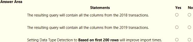
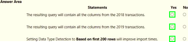
Explanation:
Box 1: Yes
The four columns used in the 2018 transactions are already displayed.
Box 2: Yes
The columns used are based on the entire dataset. The additional columns in the 2019 files will be detected.
Box 3: Yes
Note: Under the hoods, Power BI will automatically detect which delimiter to use, and may even promote the first row as headers. You can manually change the delimiter, or define how Power BI should handle data types. You can set it to automatically detect data types based on first 200 rows, or the entire dataset or you can even opt out the detection of data types.
Note: This question is part of a series of questions that present the same scenario. Each question in the series contains a unique solution that might meet the stated goals. Some question sets might have more than one correct solution, while others might not have a correct solution.
After you answer a question in this scenario, you will NOT be able to return to it. As a result, these questions will not appear in the review screen.
You have several reports and dashboards in a workspace.
You need to grant all organizational users read access to a dashboard and several reports.
Solution: You publish an app to the entire organization.
Does this meet the goal?
- A . Yes
- B . No
B
Explanation:
https://docs.microsoft.com/es-es/power-bi/collaborate-share/service-create-distribute-apps
You have a semantic model that contains two tables named Sales and Date. The Sales table relates to the Date table by using a many-to-one relationship.
The Sales table contains the following columns:
• Date
• Product
• SalesAmount
You need to create a DAX measure for a rolling 31 -day sales total that will return the total sales amount for a selected date and the previous 30 days.
Which DAX expression should you use?
- A . CALCULATE(SUM(Sales[SalesAmount]), DATESBETWEEN(Date[Date], Max(‘Date'[Date])-36, Max(‘Date'[Date])))
- B . CALCUlATE(SUM<Sales[SalesAmountJ), 0ATEA00(Date[Date], -36, DAY))
- C . CALCULATE(SUM(Sales[SalesAmount]), DISTINCTCOUNT(Date[Date]) = 31)
- D . CALCULATE(SUM(Sales[SalesAmount]), DATESHTD(Date[Date]))
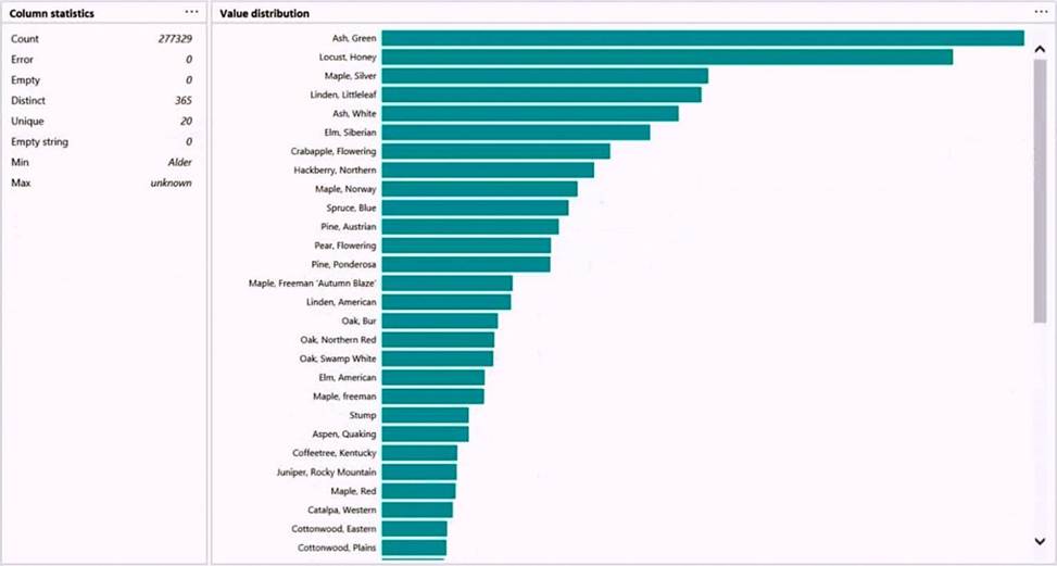
HOTSPOT
You are profiling data by using Power Query Editor.
You have a table that contains a column named column1. Column statistics and Value distribution for column1 are shown in the following exhibit.


You are building a Power BI report to analyze customer segments.
You need to identify customer segments dynamically based on the Bounce Rate across dimensions such as source, geography, and demographics. The solution must minimize analysis effort.
Which type of visualization should you use?
- A . decomposition tree
- B . funnel chart
- C . Q&A
- D . key influencers
A
Explanation:
The key influencers visual is a great choice if you want to:
See which factors affect the metric being analyzed.
Contrast the relative importance of these factors. For example, do short-term contracts affect churn more than long-term contracts?
Note: The key influencers visual helps you understand the factors that drive a metric you’re interested in. It analyzes your data, ranks the factors that matter, and displays them as key influencers. For example, suppose you want to figure out what influences employee turnover, which is also known as churn. One factor might be employment contract length, and another factor might be commute time.
https://docs.microsoft.com/en-us/power-bi/visuals/power-bi-visualization-influencers
Which type of dimension is represented by Dim Address?
- A . role-playing dimension
- B . degenerate dimension
- C . junk dimension
- D . Type 2 slowly changing dimension (SCD)
You have sales data in a star schema that contains four tables named Sales, Customer, Date, and Product.
The Sales table contains purchase and ship dates.
Most often, you will use the purchase date to analyze the data, but you will analyze the data by both dates independently and together.
You need to design an imported dataset to support the analysis. The solution must minimize the model size and the number of queries against the data source.
Which data modeling design should you use?
- A . Use the Auto Date/Time functionality in Microsoft Power BI and do NOT import the Date table.
- B . Duplicate the Date query in Power Query and use active relationships between both Date tables.
- C . On the Date table, use a reference query in Power Query and create active relationships between Sales and both Date tables in the modeling view.
- D . Create an active relationship between Sales and Date for the purchase date and an inactive relationship for the ship date.
D
Explanation:
Only one relationship can be active.
Note: If you query two or more tables at the same time, when the data is loaded, Power BI Desktop attempts to find and create relationships for you. The relationship options Cardinality, Cross filter direction, and Make this relationship active are automatically set.
Reference: https://docs.microsoft.com/en-us/power-bi/transform-model/desktop-create-and-manage-relationships
You are developing a sales report that will have multiple pages. Each page will answer a different business question.
You plan to have a menu page that will show all the business questions.
You need to ensure that users can click each business question and be directed to the page where the question is answered. The solution must ensure that the menu page will work when deployed to any workspace.
What should you include on the menu page?
- A . Create a text box for each business question and insert a link.
- B . Create a button for each business question and set the action type to Bookmark.
- C . Create a Power Apps visual that contains a drop-down list. The drop-down list will contain the business
questions.
B
Explanation:
When you create a bookmark, the following elements are saved with the bookmark: – The current page – Filters – Slicers, including slicer type (for example, dropdown or list) and slicer state – Visual selection state (such as cross-highlight filters) – Sort order – Drill location – Visibility of an object (by using the Selection pane) – The focus or Spotlight modes of any visible object
Note: This question is part of a series of questions that present the same scenario. Each question in the series contains a unique solution that might meet the stated goals. Some question sets might have more than one correct solution, while others might not have a correct solution.
After you answer a question in this section, you will NOT be able to return to it. As a result, these questions will not appear in the review screen.
You have five reports and two dashboards in a workspace.
You need to grant all organizational users read access to one dashboard and three reports
Solution: In Microsoft Azure Active Directory (Azure AD), part of Microsoft Entra. you create a group that contains all the users. You share each selected report and the one dashboard to the group.
Does this meet the goal?
- A . Yes
- B . No
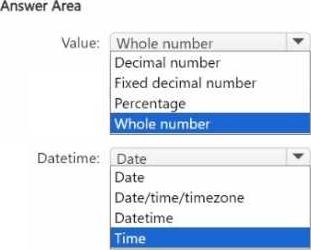
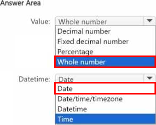
HOTSPOT
You use Power Query Editor to ingest data into Power Bl Desktop.
The total dataset contains 250,000 rows.
All the rows match the format of the data as shown in the following exhibit.
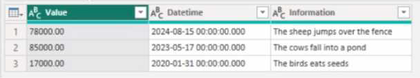
You need to optimize the data model size of the table.
Which type of data should you use for the Value column and the Datetime column? To answer, select the appropriate options in the answer area. NOTE: Each correct selection is worth one point.