
Practice Free PL-300 Exam Online Questions
You have a semantic model that connects to a streaming data source. The data source is updated
frequently.
You need to create a Power B1 report that meets the following requirements:
• Supports real-time analytics
• Minimizes performance impact on the data source
• Displays the most recent data without performing a data refresh
Which connectivity mode should you use for the dataset?
- A . push mode
- B . import mode
- C . LiveConnect mode
- D . DirectQuery mode
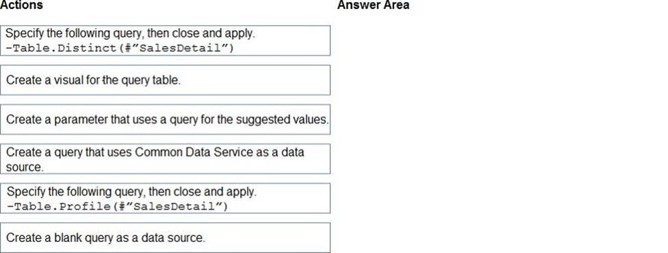
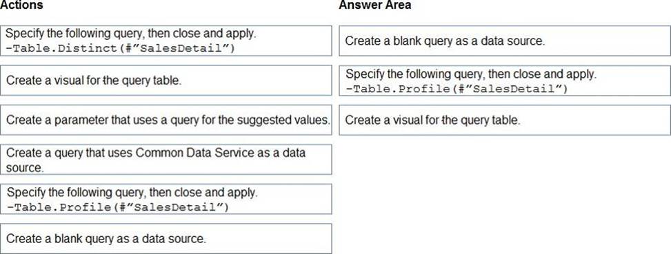
DRAG DROP
You are modeling data in table named SalesDetail by using Microsoft Power Bl.
You need to provide end users with access to the summary statistics about the SalesDetail dat a. The users require insights on the completeness of the data and the value distributions.
Which three actions should you perform in sequence? To answer, move the appropriate actions from the list of actions to the answer area and arrange them in the correct order.
You plan to use Power BI Desktop optimized for Power BI Report Server to create a report. The report will be published to Power BI Report Server.
You need to ensure that all the visualization in the report can be consumed by users.
Which two types of visualizations should you exclude from the report? Each correct answer presents part of the solution. NOTE: Each correct selection is worth one point.
- A . Funnel charts
- B . Custom visuals
- C . Bubble maps
- D . Breadcrumbs
- E . R visuals
D,E
Explanation:
Reference: https://powerbi.microsoft.com/en-us/guided-learning/reportserver-quickstart-powerbi-report/
You need to create a calculated column to display the month based on the reporting requirements.
Which DAX expression should you use?
- A . FORMAT(‘Date'[date], "MMM YYYY")
- B . FORMAT(‘Date’ [date], "M YY")
- C . FORMAT(‘Date'[date_id], "MMM") & "" & FORMAT(‘Date'[year], "#")
- D . FORMAT(‘Date’ [date_id], "MMM YYYY")
You have a Power Bl workspace named Workspace1 that contains a dataset named DS1 and a report named RPT1.
A user wants to create a report by using the data In DS1 and publish the report to another workspace.
You need to provide the user with the appropriate access. The solution must minimize the number of access permissions granted to the user.
What should you do?
- A . Share RPT1 with the user.
- B . Add the user as a Viewer of Workspace1.
- C . Add the user as a member of Workspace1.
- D . Grant the Build permission for DS1 to the user.
D
Explanation:
Microsoft says: To copy a report to another workspace, and to create a report in another workspace based on a dataset in the current workspace, you need Build permission for the dataset. For datasets in the original workspace, if you have at least the Contributor role, you automatically have Build permission through your workspace role.
https://learn.microsoft.com/en-us/power-bi/collaborate-share/service-roles-new-workspaces
You have a Power BI report that uses a dataset based on an Azure Analysis Services live connection.
You need to ensure that users can use Q&A from the Power BI service for the dataset.
What should you do?
- A . From the Power BI service, add an enterprise gateway to the dataset.
- B . From Power BI Desktop, add synonyms and suggested questions.
- C . From Power BI Desktop, add a Q&A visual to the report.
- D . From the Power Bi service, select Turn on Q& A for this dataset.
You have a Fabric workspace named Workspace1 and a group named Group1.
You need to ensure that the members of Group1 are notified when there are issues in Workspace1.
The solution must follow the principle of least privilege.
What should you do?
- A . Assign Group1 the Member role for Workspace").
- B . Assign Group1 the Admin role.
- C . Update the contact list to include Group1.
- D . Assign Group1 the Contributor role for Workspace1.
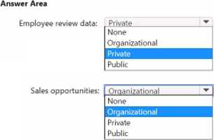
HOTSPOT
You have a Power Bl semantic model that contains the data sources shown in the following table.
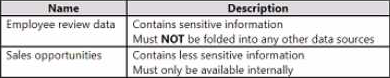
You need to configure the privacy levels of the data sources.
What should you configure (01 each data source? To answer, select (he appropriate options in the answer area. NOTE: Each correct answer is worth one point.
Note: This question is part of a series of questions that present the same scenario. Each question in the series contains a unique solution that might meet the stated goals. Some question sets might have more than one correct solution, while others might not have a correct solution.
After you answer a question in this section, you will NOT be able to return to it. As a result, these questions will not appear in the review screen.
You are modeling data by using Microsoft Power Bl. Part of the data model is a large Microsoft SQL Server table named Order that has more than 100 million records.
During the development process, you need to import a sample of the data from the Order table.
Solution: You add a report-level filter that filters based on the order date.
Does this meet the goal?
- A . Yes
- B . No
B
Explanation:
The filter is applied after the data is imported.
Instead add a WHERE clause to the SQL statement.
Reference: https://docs.microsoft.com/en-us/power-bi/connect-data/service-gateway-sql-tutorial
You plan to create a dashboard in the Power BI service that retrieves data from a Microsoft SQL Server database. The dashboard will be shared between the users in your organization.
You need to ensure that the users will see the current data when they view the dashboard.
How should you configure the connection to the data source?
- A . Deploy an on-premises data gateway (personal mode). Import the data by using the Import Data Connectivity mode.
- B . Deploy an on-premises data gateway. Import the data by using the Import Data Connectivity mode.
- C . Deploy an on-premises data gateway. Import the data by using the DirectQuery Data Connectivity mode.
- D . Deploy an on-premises data gateway (personal mode). Import the data by using the DirectQuery Data Connectivity mode.
D
Explanation:
Reference: https://docs.microsoft.com/en-us/power-bi/desktop-directquery-about#power-bi-connectivity-modes